


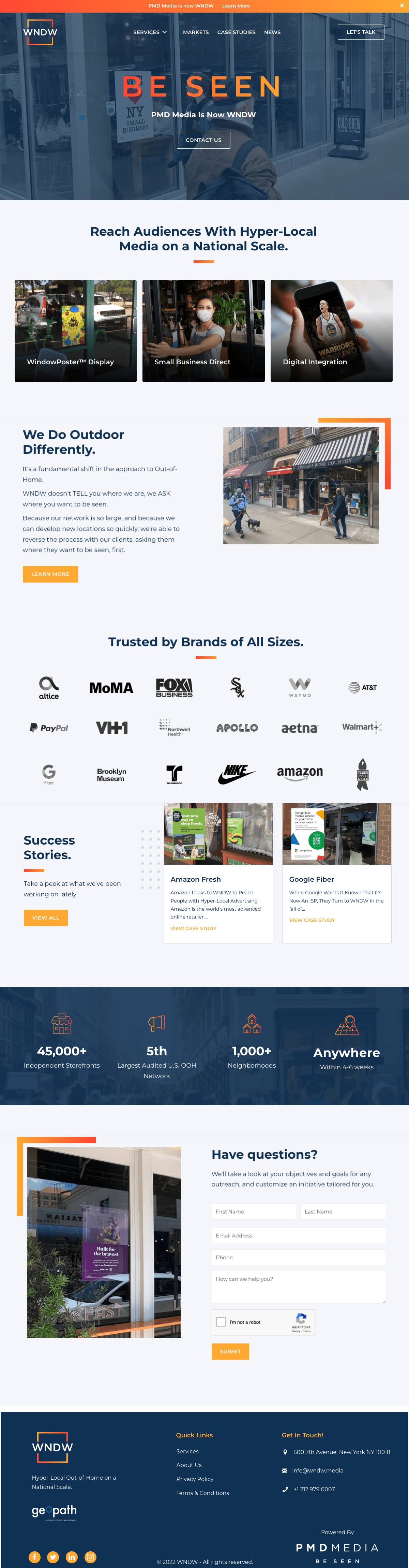
Leading OOH agency PMD Media chose MAGNETIK to guide their corporate rebrand to become WNDW. As one of the largest OOH media agencies, WNDW specializes in hyperlocal placements including storefronts and convenience stores.
For the logo, Magnetik’s team focused on simple iconography and elements that could telegraph the meaning of WNDW without being completely literal. In the end, the design chosen, like a real window, is a frame. But WNDW’s frame is open , representing the opportunity that WNDW brings to both markets and storefront owners.
The mix of hot and cold colors balances the brand system. Key imagery is subtle and ghosted behind monotones .
The team translated the brand to a marketing-driven WordPress site, slide templates, corporate collateral and more.
Client
WHAT WE DID
Strategy / Branding / Responsive Web Design / WordPress Development